Free delivery on two shirts or more | 30-day returns | 12-month warranty
English
Support



Free delivery on two shirts or more | 30-day returns | 12-month warranty
OUR BLOG
Latest news, tips, and insights
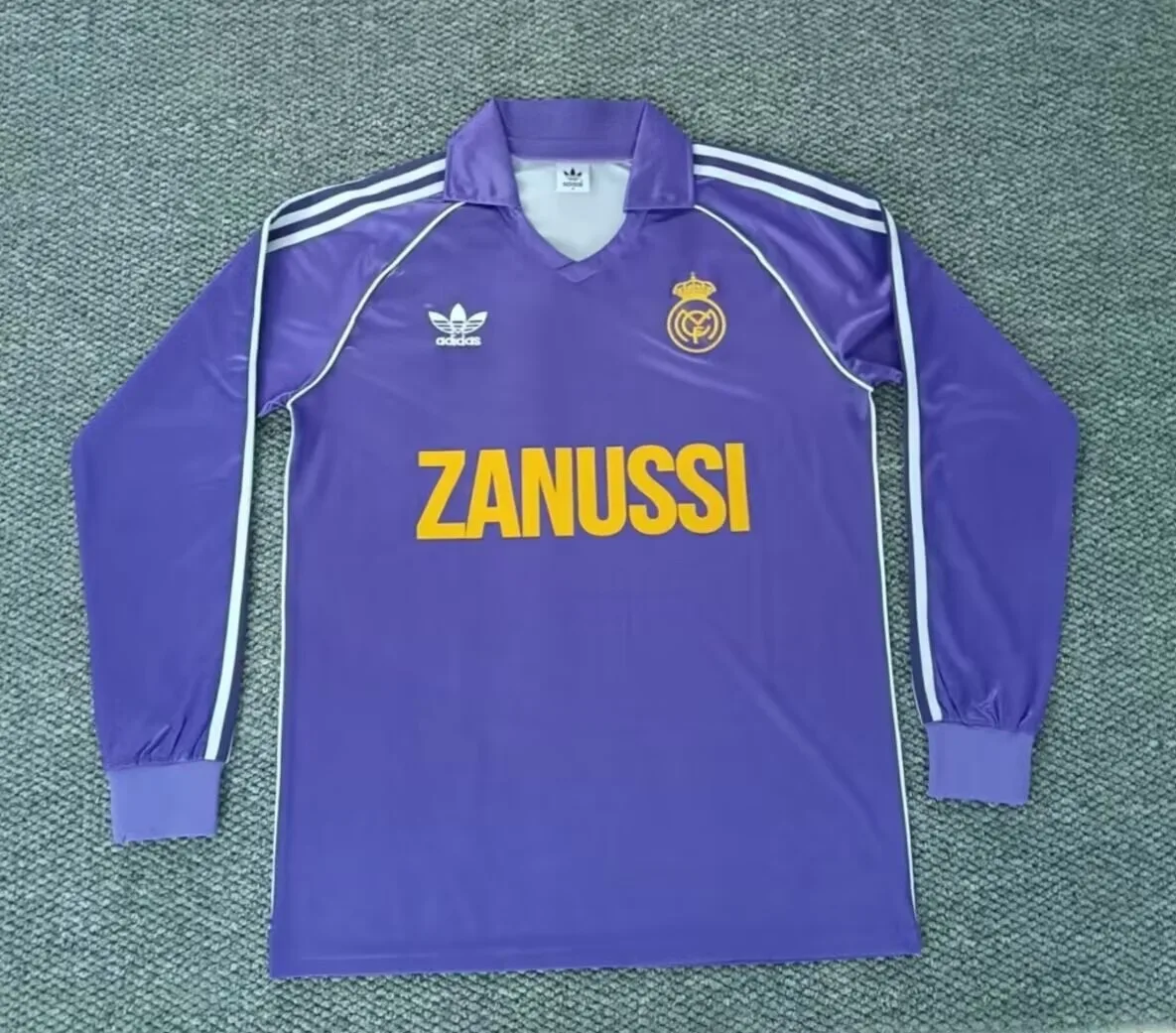
Date a football shirt by reading several clues together: collar shape, fabric feel, badge finish, sponsor position, sleeve style and overall cut.
Learning how to identify a football shirt era is part detective work, part feel for design. A single detail can mislead you, but the full mix of collar, fabric, badge, sponsor placement, cut and length usually tells a clear story. This guide is written for collectors, gift buyers and fans browsing retro football shirts who want to understand what they are looking at before choosing a piece.
Before checking tiny details, hold the shirt up and look at its shape. Older shirts often look boxier, shorter and wider through the body. Many shirts from the 1970s and early 1980s have a simple athletic cut, with straight side seams and a length that sits closer to the waist than modern fan shirts. Long sleeves from this period can look especially narrow at the cuff, which is why browsing long-sleeve football shirts is useful when training your eye.
By the 1990s, football shirts often became roomier. Wide bodies, dropped shoulders and generous sleeves are common visual clues. This is the era many people picture when they think of bold retro design: larger patterns, heavier collars and a relaxed fit that works well as streetwear. In the 2000s, the outline starts to tighten. Shirts usually become longer, neater and more performance-led, with shaped panels and cleaner sides.
Current-season shirts tend to be more streamlined. They are usually lighter, longer and cut with more attention to movement. The body may taper slightly, the sleeves often sit closer to the arm, and the hem is usually more consistent. At Your Jersey FC, many shirts are available from XS to 5XL, so always separate era from size: a 1990s shirt in a small size can still have a boxy period shape, while a modern 3XL will naturally feel roomy.
Collars are among the quickest era clues. In the 1970s, football shirts often borrow from polo and rugby shapes: pointed collars, open necks, V inserts and simple ribbed cuffs. The look is clean, practical and often minimal. If the collar feels like part of a casual sports top rather than a technical garment, you may be looking at a design language from that earlier period.
The 1980s bring more variety. You may see bigger collars, sharper V-necks, button plackets, contrast trims and thicker ribbing. Designs still feel relatively simple compared with the 1990s, but the neck area starts to carry more personality. Sponsor panels and club details also begin to change how the front of the shirt is balanced.
The 1990s are the loud decade for collars. Grandad collars, oversized fold-over collars, laced-style necks, deep button openings and layered V-necks all appear in different forms. If the collar is one of the shirt’s main features, with strong colour blocking or unusual construction, it is often a sign of a 1990s influence. Many modern retro-inspired shirts imitate this language, so check the fabric and labels too.
From the 2000s onward, collars generally become lower-profile. Crew necks, neat V-necks and slim ribbed openings are common. Modern shirts often reduce bulk around the neck to improve comfort and movement. Today’s designs may bring back a vintage collar, but the materials, printing and cut usually reveal that the shirt belongs to the current era.
Fabric is one of the best practical clues because it is hard to fake by shape alone. Shirts from the 1970s are often heavier than modern shirts, with a matte, woven or cotton-rich feel. They may absorb light rather than shine. Ventilation is basic, and the shirt may feel more like a durable sports top than a featherweight performance garment.
During the 1980s and 1990s, synthetic fabrics become more obvious. You may notice a smoother surface, a slight sheen, jacquard patterns woven into the material, or raised textures that appear when the shirt catches the light. The 1990s are especially known for tonal patterns: club symbols, geometric shapes, shadow stripes and abstract prints worked into the fabric rather than simply placed on top.
In the 2000s, the texture becomes more technical. Panels may use different weaves, underarm areas may be lighter, and mesh zones become more common. Current shirts usually feel lighter still, with thin, breathable fabric and precise seams. If you are comparing pieces across eras, open a few options in all football shirts and look for differences in shine, thickness, panel construction and collar weight.
Badges change a lot across eras. Earlier shirts often have stitched or embroidered-looking crests, sometimes on a separate patch. The badge may feel raised, textured or slightly imperfect because it is made from thread or layered material. In later decades, badges can become flatter, lighter and more integrated with the shirt. Modern versions may use heat-applied details for a cleaner feel.
Sponsor placement is another useful clue. In the 1970s, many shirts have no front sponsor at all, depending on the club, competition and country. Through the 1980s, chest sponsors become more common and often appear as simple wordmarks or blocky panels. The 1990s tend to make the sponsor a major part of the design, sometimes large, central and visually tied to the shirt’s pattern.
By the 2000s and today, sponsor layouts are more regulated and cleaner. The front logo usually sits in a predictable central area, with sleeve marks or secondary placements on some shirts. The printing itself is often lighter and smoother. If you add name and number printing to a shirt from Your Jersey FC, think about era mood: blockier numbers suit many retro looks, while sleeker styles feel more modern.
These are tendencies, not rigid rules. National team shirts can follow different rhythms from club shirts, and tournament designs often become style markers of their own. If you collect international shirts, compare examples in national team football shirts and notice how flags, federation badges and tournament graphics change the visual language.
The smartest approach is to combine all clues. A 1990s-style collar on a very light, current fabric probably signals a modern retro-inspired shirt. A simple V-neck with heavy fabric, short length and a stitched badge may point much earlier. For current designs, compare the latest options in current-season football shirts and notice how clean the construction feels next to older styles.
Finally, buy for the way you plan to wear it. Some collectors love the boxy 1990s drape; others prefer a lighter modern fit. Your Jersey FC offers secure payment by card or PayPal, free delivery from two shirts, 30-day returns and a 12-month warranty, so you can focus on finding the era, club or national side that feels right for your wardrobe.


Rarely. A collar, badge or sponsor layout can suggest a period, but many modern shirts borrow older design ideas. The safest method is to compare several clues together: fabric weight, cut, sleeve shape, badge finish, printing style and overall proportions.
Not always, but many 1990s shirts have a wider, boxier feel than modern shirts. Size also matters. A small 1990s shirt can still look period-correct in shape, while a large current shirt may feel roomy simply because of its size.
Choose retro if you like distinctive collars, relaxed cuts and visible period details. Choose current-season shirts if you prefer lighter fabrics, cleaner finishing and a more streamlined fit. Comparing both styles side by side makes the difference easy to feel.

Every kit tells the story of a season. We write about the ones worth remembering.